Resurrecting Skeuomorphism
Skeuomorphism gets a bad wrap. When I worked at Microsoft it was about the worst designation you could give something. At the time Microsoft was really at the forefront of the digital interface revolution we have seen, you know... the whole beautifully digital - embrace the form factor thing, flat is all that (ok, I made the last one up).
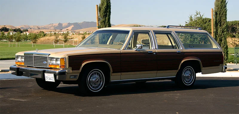
A skeuomorph is basically just an object that is ornamented to look like another object. My families station wagon had wood paneling on the side. That was a skeuomorph. (honestly, who would want a car made of wood though? I imagine it wouldn't do so well in a high speed crash.) Let's look at the big 3 companies approach to this dying trend.
Apple - Skeuomorphisms Fanboy
So, Apple truly embraced skeuomorphism, particularly with the iPhone. This made a lot of sense because it would create familiar navigational metaphors in a completely new form factor. With it we saw voice recorders that looked like microphones, text editors that looked like notepads and digital book listings that look like bookshelves. But as we got used to using digital interfaces the need for skeuomorphism decreased and designers started to rebel against it.


Microsoft - Full Flat
Microsoft was an early rebel and they rejected skeuomorphism fully and completely. I was working there at the time. They wanted to send a message to the competition; that Microsoft was different and able to reinvent itself. They removed all bevels, drop shadows and gradients from their UI in Windows Phone 7. They wanted typography and content to rule the design of the OS. They called it Metro and it was stylish. But it had one drawback, every app looked the same so it was hard to orient yourself. I could never tell if I was in the photos app or the contacts app or Foursquare or calculator for that matter. I call it the skeuo-minimalist-maze. There's a name for everything.
Google - Half Flat

Google responded with their take on the flat UI. Their design system is called Material and it is a reintroduced skeuomorphic design. Their desire was to make the UI appear tactile while still being primarily flat. Some people refer to this as skeuo-minimalism. There's a name for everything.
Apple Round 2 - Hippy hypbrid

Apple's 2013 redesign also took a hybrid approach. They flattened their UI elements for the most part but kept slight bevels on their buttons and shadowing on certain controls, so depth and form are still elements of the design. They also went gradient crazy. Everything is in a wash of tie-die. Where Apple's language feels unique is in its gradients and frosted glass effects. But ultimately is still referencing some physicality. I call it skueo-hippy-minimalastic. There's a name for everything.
Conclusion
Microsoft made the valiant effort to rid the world of gaudy ornamented software but as we have seen it is hard to shake, and the world may not be ready for a fully digital experience. We still find comfort in UI metaphors that reference physical objects, and that's OK. The trend is leading us towards fully flat designs but we don't need to jump the gun. It's like a child who can't wait to grow up. We just aren't there yet and until we are we should use take advantage of skeuomorphism to help instruct and educate our users.